Sunday, September 29, 2013

Ambient Devices

Ambient devices are generating ambient information that is to be perceived subconsciously. Their major purpose is to remain in the background and only catch a persons attention when important events are happening.

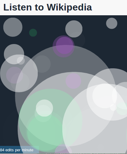
Ambient information is reduced to the core information of the data and ambient devices are transmitting this minimal information in a subtle way. This way, the amount of concentration required to monitor particular processes or values is reduced enormously.  

Clive Thompson from the New York Times wrote an article about ambient information in 2002 investigating how ambient displays will change the way we perceive data:
'The ultimate goal is to tame our information so it no longer frazzles. Instead, it creates ''calm and comfort,'' as the computer scientists Mark Weiser and John Seely Brown wrote in a prophetic 1996 paper on ambient information, ''The Coming Age of Calming Technology.''Consider how counterintuitive this is. We've been cramming stock tips, horoscopes and news items onto our computers and cellphones -- forcing us to peer constantly at little screens. What if we've been precisely wrong? It's the new paradox of our data world. ''The way to become attuned to more information,'' Weiser and Brown noted, ''is to attend to it less.'''
Characteristics of ambient displays and the qualities of the auditory display being created during this research project are very much alike and every attribute can be interpreted acoustically as well as visually.

A practical example is the Stock Orb by Ambient TM, which emits light to display information. Changing parameters of this light that are mapped to the data are the light's color, intensity and pulsing frequency.

Product Picture of the Stock Orb by Ambient TM

All these attributes can be transferred and implemented on a sine wave from a tone generator as well. Keeping in mind that sound and light are both waves that are just in entirely different frequency ranges, creating an ambient display based on sound instead if light with the same characteristics and qualities does not appear far-fetched.

As the requirements to the planned auditory display and its purpose in the working environment are very similar to the ones of an ambient device, investigating and evaluating the modes of operation of various ambient displays and ambient devices in general is vital for the project and the implementation of the physical prototype inside DataShaka's office space. The prototype must align with the classic requirements and features of an ambient device and will be challenged as such.
The implemented sonification system will be functioning as an Ambient Auditory Display.

Hence, apart from sonification, a major research focus lies on ambient devices. Below is a collection of important papers and sources that are further investigated.


Towards a Taxonomy for Ambient Information Systems 

by Martin Tomitsch , Andreas Lehner , Thomas Grechenig 
We propose a set of design dimensions that constitute the axes of a taxonomy for ambient information systems. The dimensions are based on an investigation of a wide range of research projects and related papers. We rank 19 ambient information systems on each axis to demonstrate the utility of the taxonomy. We further discuss other similar taxonomies and compare them to our approach.


Evaluating the comprehension of ambient displays

by Lars Erik Holmquist 
We introduce an evaluation framework for ambient displays, with three levels of comprehension: that data is visualized; what is visualized; and how it is visualized.

Evaluating an ambient display for the home

by Sunny Consolvo, Jeffrey Towle
We present our experiences with evaluating an ambient display for the home using two different evaluation techniques: the recently proposed 'Heuristic Evaluation of Ambient Displays' and an in situ, 3-week long, Wizard of Oz evaluation. We compare the list of usability violations found in the heuristic evaluation to the set of problems that were discovered in the in situ evaluation. Overall, the 'Heuristic Evaluation of Ambient Displays' was effective - 75% of known usability problems were found by eight evaluators (39-55% were found by 3-5 evaluators). However, the most severe usability problem found in the in situ evaluation was not identified in the heuristic evaluation. Because the problem directly violated one of the heuristics, we believe that the problem is not with the heuristics, but rather that evaluators have minimal experience with ambient displays for the home.

Ambient Display using Musical Effects

by Luke Barrington ,Michael J. Lyons ,Dominique Diegmann ,Shinji Abe
The paper presents a novel approach to the peripheral display of information by applying audio effects to an arbitrary selection of music. We examine a specific instance: the communication of information about human affect, and construct a functioning prototype which captures behavioral activity level from the face and maps it to musical effects. Several audio effects are empirically evaluated as to their suitability for ambient display. We report measurements of the ambience, perceived affect, and pleasure of these effects. The findings support the hypothesis that musical effects are a promising method for ambient informational display.


References
___________________________
Thompson, C. 2002. News That Glows. New York Times, 15 December.
Ambientdevices.myshopify.com. 2013. Ambient Devices. [online] Available at: http://ambientdevices.myshopify.com/ [Accessed: 28 Sep 2013].

Friday, September 27, 2013

Classifying metrics

To be able to create meaningful data representations of metrics that are useful to a business, it is important to identify the metrics that matter the most. This is important for any type of data representation, such as classic dashboards, interactive data environments or a data sonification. Those particular metrics are not always obvious and companies often take a lot of effort in identifying the metrics matter the most for their business. It is not unusual that those metrics are hidden in the raw data the company produces during their every day process, which means that they can only be revealed though calculation. Such calculations could be the difference between two correlating signals or the amount of a particular signal exceed its standard variance. One can differentiate between metrics that have immediate matter and relevance, such as the availability of the company's services, and metrics that matter in the long run and are examined retrospectively. The data sonification project "Listening to the Heart of Business" focuses on live metrics that possibly can have an immediate impact on the business.

From a DataShaka perspective, there is a large amount of metrics that have to be monitored constantly. DataShaka is a data unification platform, harvesting data from different sources for their clients, unifying that data and then storing and delivering it to their clients. Many data files are constantly harvested, processed, unified and validated on a cloud machine. Furthermore, a Microsoft Azure powered storage platform named DISQ (Dynamic Intelligent Storage Query) is storing and delivering that data. As all these processes are constantly happening in the background and vital for keeping the heartbeat of the business alive, it is important to know if everything is running smoothly or if problems are occurring and where these problems are coming from.

Below is a list identifying specific metrics that matter most for the DataShaka company, from a business perspective as well as a developer's perspective:

The metrics that matter
  • Number of Data Files
    • processing
    • stuck
  • Cloud Machine Statistics
    • CPU
    • Memory
    • Network
    • Free Disc Space
  • Speed Query Responds
    • duration
    • failure
  • UDPs (Unified Data Points)
    • uploaded
    • downloaded
  • Steps processing Data Files
    • failed
    • completed
  • User Login
  • Users logged in
  • Data file process kicked off

All these business metrics are structurally time series data. Additionally, each time series point (TSP) for these metrics contains some pieces of context.

The first classification that can be done on those metrics is to differentiate between metrics that are basically just events and only communicate that something particular has happened, and continuous metrics where the actual numbers are relevant. There are also metrics however, that are basically just events, but that event inherits a particular value which is very relevant. Consequently, there are three different categories these metrics can be classified to:
  • Binary Event Metrics
  • Complex Event Metrics
  • Continuous Metrics
Looking at classic sonification techniques, this could a possible way to apply sound to each type of metric:

Binary Event Metrics => Auditory Icons
Complex Event Metrics => Earcons
Continuous Metrics => Parameter Mapping

An explanation of sonification techniques can be found in a previous blog post here.

In every case, each metric is a point in time that contains a particular value, may it be for a constantly changing metric (such as CPU usage of a cloud machine), as well as a simple event, where the value is binary only switches between 0 and 1. All these metrics additionally inherit context, basically being what their value represents (query respond time, CPU, etc.).

This particular way of looking at data is coherent with DataShaka's data ontology TCSV, describing a time based content-agnostic and context-driven data representation. This particular data ontology and its relation to the sonification project will be further discussed in future posts. 

Looking at the metrics that matter identified above and applying them to the three classes that have been created, they can be structured the following way:
  • Binary Event Metrics (Auditory Icon)
    • Speed Query Responds
      • failure
    • Steps processing Data Files
      • failed
      • completed
    • User Login
  • Complex Event Metrics (Earcon)
    • Speed Query Responds
      • duration (Time)
    • UDPs (Unified Data Points)
      • uploaded (Amount)
      • downloaded (Amount)
    • Data file process kicked off (Size of File)
  • Continuous Metrics (Parameter Mapping)
    • Number of Jobs
      • processing
      • stuck
    • CPU/Memory/Network/etc
    • Free Disc Space
    • Users logged in

Wednesday, September 25, 2013

Sonification in Web Based Applications using JavaScript

Generally speaking, there is an infinite amount of possibilities to create and trigger sound on a computer, such as using combinations of MIDI and/or pureData, Processing, OpenFrameworks, software synthesizers, Java/JavaScript or C++/C#.

When developing sonification for a web based environment, several options using HTML5 and/or JavaScript libraries exist, to create sounds or play sound files. Some of these possibilities in relation to classic sonification techniques have been examined closer. An explanation of sonification techniques can be found in a previous blog post here.


HTML5


There are different possibilities to embed audio in a website without using JavaScript. Using the <audio controls> tag introduced in HTML5, audio files can be integrated into a website the following way:

<audio id="audiotag1" src="audio/flute_c_long_01.wav" preload="auto"></audio>


Using simple JavaScript methods, these sound files can then interactively be triggered:
<audio id="audiotag1" src="audio/flute_c_long_01.wav" preload="auto"></audio>
<a href="javascript:play_single_sound();">Play 5-sec sound on single channel</a>
<script type="text/javascript">
    function play_single_sound() {
        document.getElementById('audiotag1').play();
    }
</script>

This is a good and effective way to play sound in browsers, though older browsers are not supported. Furthermore, there are no dynamic effects available, so all alterations to the sound have to be happen somewhere in the back end. Therefore only auditory icons could be triggered this way, any sonification techniques that need sounds to dynamically change with the data (such as earcons or parameter mapping) won't be easily implemented.


howler.js


Howler.js is a JavaScript library used to trigger audio files, such as *.mp3, *.ogg or *.wav. Parameters that can be altered are volume and panning, which is even possible in surround 3D. Additionally, fade in and out effects are implemented as well. A loop flag can be set to constantly repeat a sound, so continuous sound waves are theoretically possible as well. 

A simple sound is defined like the following:

var sound = new Howl({
  urls: ['sound.mp3']
}).play();

Setting the loop flag and altering the volume is done in the following way:
var sound = new Howl({
  urls: ['sound.mp3', 'sound.ogg', 'sound.wav'],
  autoplay: true,
  loop: true,
  volume: 0.5,
  onend: function() {
    console.log('Finished!');
  }
});

Disadvantages using this particular library are the absence of audio filters or any other audio effects.
Therefore, this library won't be useful to play earcons, as no parameters can be altered to change the sound. For classic auditory icons however, this library proves to be extremely handy.


jsfx.js


jsfx.js is roughly speaking an online synthesizer, that can create dynamic synthesized sounds. There are various parameters that can be altered dynamically, such as the ADSR curve (Attack, Decay Sustain, Release), Slide, Vibrato, Phaser or LP and HP Filters. A new sound is defined the following way:
audioLibParams = {
    test : ["noise",0.0000,0.4000,0.0000,0.0060,0.0000,0.1220,20.0000,460.0000,2400.0000,-0.5240,0.0000,0.0000,0.0100,0.0003,0.0000,0.0000,0.0000,0.0000,0.0000,0.0000,0.0000,0.0000,0.9990,0.0000,0.0000,0.0000,0.0000]
  };

  samples = jsfxlib.createWaves(audioLibParams);
  samples.test.play();
  samples.explosion.play();
This array contains all information about the sound being triggered and can be created with an online tool.  

To alter those values interactively, like mapping data values to particular effects, one has to know which value represents which parameter. As all these values have completely different ranges and represent entirely different sound parameters, using this library will prove difficult to achieve the desired outcome in the sound design. Another disadvantage that flagged during first experiments was, that problems occurred when trying to trigger multiple sounds in parallel. What is also missing is a way to generate a continuous sound. As all sounds have an ADSR curve, a continuous wave generator is not implemented. 
Therefore, this library won't be useful for the parameter mapping sonification technique, as it is not possible to create continous sounds. For auditory icons and espicailly earcons however, this library contains high potential and is very suitable, as all triggered sounds can be altered and a large number of paramters can be changed every time before the sound is triggered. Experimenting with the online tool to create new sounds points out to be very fun and exciting.


timbre.js


timbre.js is sound library to create and influence sound waves very similar to a standard synthesizer. The library is well documented and appears to be very powerful. It also possible to trigger audio files. A simple sine wave is already initialized the following way:

T("sin", {freq:880}).play();
Several wave forms can be created, as well as noise.
Various effects, such as tremolo, vibrato, filtering or phaser effects can be implemented: Since it is possible to code very deep with this library and all the sound synthesis is generated with raw numbers, it is possible to create any desired sound effect:

var freq = T("pulse", {freq:5, add:880, mul:20}).kr();

T("sin", {freq:freq, mul:0.5}).play();
To create beautiful and meaningful sound design with this library however appears to be very time consuming, as most things have to be coded by hand (compared to jsfx.js, which already comes with a ready synthesizer interface). The possibilities using this sound library on the other hand are immense and it appears to be one of the most powerful sound libraries for JavaScript out there.

First experiments with each of those sound libraries in combination with data being read from a csv file using the data visualization library d3.js can found here.

References


GitHub. 2013. timbre.js. [online] Available at: https://github.com/mohayonao/timbre.js/ [Accessed: 25 Sep 2013].
GitHub. 2012. jsfx. [online] Available at: https://github.com/egonelbre/jsfx [Accessed: 25 Sep 2013].
GitHub. 2013. howler.js. [online] Available at: https://github.com/goldfire/howler.js [Accessed: 25 Sep 2013].
W3schools.com. 2013. HTML5 Audio. [online] Available at: http://www.w3schools.com/html/html5_audio.asp [Accessed: 25 Sep 2013].

Monday, September 23, 2013

Wikipedia Sonification

A related project taking a very similar approach on the sonification of live metrics is "Hatnote", a web based auditory display to show activity on Wikipedia. Sonfied are additions and subtractions to texts, as well as new user registrations. The project has been realized with the JavaScript libraries d3.js and howler.js.

This project is a very nice example how auditory displays can be used as an ambient device, creating a nice harmonic soundscape. After a short time, the soundscape will only be recognized subconsciously be the user, only raising the attention when major events occur or the harmony is disturbed.


The life project can be found here: http://listen.hatnote.com/

Sunday, September 22, 2013

Technical Setup Prototype Mark I (2)

The technical implementation of the first prototype has been sketched in more detail after continuous research and the meeting with the supervisors. The entire system will basically consist of three parts: The "metric cloud", the back end and the front end.
The list below points out all considered technical paths for each part:
  1. The cloud (where all the metrics come from)
    1. DISQ (DataShaka's internal storage platform)
    2. DataDog
  2. The Back End (where the metrics are pulled and calculated)
    1. Server
    2. Microsoft Azure Workrole (C#, R, Mathematica, MathLab)
  3. The Front End (the actual visible application and interface)
    1. HTML5
    2. d3.js
    3. howler.js
    4. timbre.js
    5. Processing.org

The image below additionally shows the path of the data through those parts, starting as raw meaningless numbers, then being calculated to more insightful values and events in the back end to then be sonified in the front end.


A previous blog post about the Technical Setup of the Prototype Mark I can be found here.

Saturday, September 21, 2013

Meeting the Supervisors

During my stay in Germany in September I came to Darmstadt to meet the supervisors of my project , Torsten Frƶhlich and Thorsten Greiner. The meeting was very productive, providing lots of feedback and new trains of thought. All take aways from this meeting are summarized in the next paragraphs:

First of all, it is important for the project to classify all the data that is used. As the intent of the sonification project is to create an audible language to translate the data, it is necessary to clearly identify all types of data being used, to be able to create a meaningful and understandable translation process. 

For the research, escaping a tunnel vision but viewing the entire topic from a more open perspective has been advised. As the project already focuses on a specific use case, this is indeed a danger for the research process and would limit the varieties of the possible outcomes of this research project.
Creating a hierarchy of all important and relevant papers about ambient displays and data sonification to get a clear overview on the current state of the entire research being conducted in those fields has also been suggested.

Other topics that had been discussed in detail were mathematics and statistics. Before transforming data to sound, it is important to know what the actual insight is, that the user would like to receive from those values. Are those particular values the values that the user is interested in, or is it the actually amount of increase/decrease of the value, or maybe only the values that exceed the standard deviation and the amount it exceeds the variance. Transforming the raw data into a more insightful and meaningful data streams is absolutely vital for a successful data sonification as meaningless raw data streams are hard to interpret, visually and especially acoustically. Creating the first and second derivation of the signal, as well as investigating the signal's variance would be the initial path for this. To put this into practice, the software Mathematica and Math Lab will be investigated, as well as the programming language R.

Additionally, lots of input on the sound design has been given, such as considering the use of overtones in the sonification's sound design, thinking about changing and altering the sound design over time as the business day passes by, as well as investigating classical approaches on acoustical representations, such as Sergei Prokofjew's Peter and the Wolf or Pictures at an Exhibition by Modest Mussorgsky (among others).

Thank you Torsten Frƶhlich and Thorsten Greiner for the great support!

Friday, September 20, 2013

Sonification Design

The following paragraphs will describe, how the sonification and sound design for the first prototype could be approached at this point of the research process:

The sound design of the first prototype will make us of a mix of earcons and continuous sounds created through parameter mapping. Artistically speaking, the planned soundscape will sound like an artificial motor or electronic heart, that represents the flow of the business. Whereas "positive metrics" (such as data successfully uploaded) will preserve the harmony and rhythm of the soundscape, errors and failures in the process and system will create sounds that disturb that harmony.

Below is a list of all metrics that will be sonified in the first prototype and what they represent for the business:

Query respond times

DataShaka continuously runs queries to all databases used by their clients and measures the response times to constantly see the performance of this account. Through that process, employers are able to view query respond times, review and compare historical query response data and most importantly see if the database is completely down. Those speed queries will be sonified with earcons. The planned sound design will be similar to a sonar, possibly adding a constant rising sound until the response comes back. This way, exceptionally long responses can be spotted inside the continuous soundscape, as the noise until the response increases.

Moving UPDs

UDP (unified data point) is a unit to measure the amount of data. It represents one single identifiable point of data in the file. This way of measuring amounts of data is more accurate than referring to the file size, as this unit is file format independent. 
UDPs are moving through different steps of the process and go through various checks before being uploaded into the database system. Failures in those steps will be represented by recognizable earcons disturbing the harmony of the overall soundscape.
When UDPs are being uploaded into the data platform successfully, the process will acoustically represented the process with constant sine waves creating a so called Shepard Tone[1]. This tone generates the auditory illusion that its frequency is continuously ascending (or descending) though it actually remains in the same frequency range. The duration of this sound is dependent on the amount of UDPs being uploaded.

PL1 Health

A cloud machine (pl1) is used by DataShaka to process most of the data. It's "vital signs", such as CPU, Memory Usage, Network Usage, Disk Usage and Space etc. are highly important, as the data flow of the company depends on it. To be aware how busy and healthy the cloud machine is, all those values will be connected to constant wave generators. The waves will become louder and more intense as the values increase. The sounds will be designed in a way, that each of these signals will be identifiable, so it is easy to figure out which parameters might become critical.

Number of Jobs

The amount of jobs being processed on the cloud computer is a relevant number for the business as well. It is important to be able to distinguish between jobs awaiting to be processed in the backlog, jobs having finished the process, jobs getting stuck during the process and jobs being processed as we speak. The amount of jobs being stuck as represented similar to the pl1 health with an increasing wave that becomes more recognizable the more pressing the problem gets (in addition to the earcons that are triggered when the job gets stuck). Similar approaches will be done for the amount of jobs being processed (in addition to the earcons that are triggered during particular steps in the process). Jobs being pulled from the backlog or pushed into done will be sonified through auditory icons or earcons.

In summary, Speed query responses and Moving UDPs will be sonified using earcons/auditory icons whereas the cloud machine metrics and the number of jobs will use parameter mapping. 
As all data is time series data, Model-Based Sonification will probably not take a major role in the sonification approach. However, since the prototype will definitely provide interactivity, e.g. to enable users to focus on particular metrics, ways on how to include this exciting sonification technique will be explored.

All these sound design approaches will be tested and evaluated for their specific use cases. This will be a major part during the first user studies, where this prototype will be put to action. 

References
Shepard, R. 1964. Circularity in judgments of relative pitch. The Journal of the Acoustical Society of America, 36 p. 2346.

Thursday, September 12, 2013

Sonification Techniques

There are major commonly used techniques to work with sound and acoustics for representing various types of data:

Auditory Icons / Earcons

Auditory Icons or Earcons are sounds being triggered when particular defined events happen in the data, e.g. a value exceeds a certain threshold. Though being used in the a similar way, there is a main difference between the two: Auditory icons are recorded sounds simply being triggered a certain events, whereas Earcons are more connected to the data and the data can influence certain parameters of the sound. The line between the two however is quite blurry.
This is an effective way to represent events.


Parameter Mapping

This techniques maps values of a dataset to parameters of a sound source, such as a digital synthesizer. This is often used to represent time series data. Each signal can be mapped to a different wave, manipulating different parameters of the sound source. Through that, the different signals become distinguishable from each other.
This technique holds possibilities to show the changes in a signal over time.

Model-Based Sonification

The approach of Model-Based Sonification is mainly focused on interaction. Auditory Icons, Earcons and Parameter Mapping are only interactive up to a certain extend, whereas model-based sonification is a method that turns the data itself into an instrument that the user can interact with and produce sounds through this interaction. So roughly speaking, without interaction, there won't be any sound.
This technique makes the data and its sonification a lot more tangible and engaging. It is however not quite practical for continuous time series data but more suitable for exploratory data analysis of large static data sets.

References
Hermann, T., Hunt, A. and Neuhoff, J. 2011. The sonification handbook. Berlin: Logos Verlag.

Wednesday, September 11, 2013

The Handbook of Sonification

The "Handbook of Sonification" is one of the major bodies of written work the project's research is focused on. It contains various different chapters about many aspects in the area of sonification. It is planned to complete the book and collect all take aways from this book by the end of September, so the research can continue deeper towards even more specific topics inside the area of data sonification. The book identifies the different techniques for sonification and their use cases, explains the laws of psycho acoustics, presents various pieces of software to be used for sonification and presents research results as well as gaps in the field, where research is yet to be conducted.

Below is the summary of the book as written on sonification.de:
This book is a comprehensive introductory presentation of the key research areas in the interdisciplinary fields of sonification and auditory display. Chapters are written by leading experts, providing a wide-range coverage of the central issues, and can be read from start to finish, or dipped into as required (like a smorgasbord menu).
Sonification conveys information by using non-speech sounds. To listen to data as sound and noise can be a surprising new experience with diverse applications ranging from novel interfaces for visually impaired people to data analysis problems in many scientific fields.
This book gives a solid introduction to the field of auditory display, the techniques for sonification, suitable technologies for developing sonification algorithms, and the most promising application areas. The book is accompanied by the online repository of sound examples.


It is on of the most important books in the field of data sonification.

References:
Sonification.de. n.d. The Sonification Handbook | edited by Hermann, Hunt, Neuhoff. [online] Available at: http://sonification.de/handbook/ [Accessed: 11 Sep 2013].

Friday, September 6, 2013

Time Plan & Gantt Chart

A detailed Gantt Chart has been created to clearly structure the limited time to complete the project and define goals and deadlines for each month.

During the first month (September), interactivity and sound design of the first prototype should be completed. At the end of the second month (October), this prototype should be able to process live data from the data platform "DataDog". During the third month, user studies will be held and evaluated. All results will be gathered and structured for later use in the written thesis. This needs to be completed by the end of the month, so the development of a second prototype containing all amendments resulting from the previous user studies can be kicked off. At the end of December, this second prototype has to be evaluated. All the noted results from both user studies will then go into the written documentation which has to be completed by the end of January as this is the final deadline for the master thesis.
Additionally, stretch goals have been defined for each month.

Below is a detailed Gantt Chart, visualising all tasks and deadlines.


Every month, it is vital to check if the deadlines have been achieved or if amendments have to be done to the Gantt Chart.

Wednesday, September 4, 2013

Technical Setup Prototype Mark I (1)

The technical setup for the first prototype of the live data sonification tool has been sketched on a whiteboard in the DataShaka office. All green text refers to technical data work required for me to do on the DataShaka side (such as gathering and sending out internal metrics, etc.); all black text represents the work that needs to be done for the development of the sonification application itself. All red underlined text represents elements that still need to be implemented. All red written text are future amendments, stretch goals or possibilities for Prototype II.


The data sonification tool itself will be a webapp, reading and storing the data stream with d3.js and creating live sound synthesis through JavaScript. Interface and design of the app will be done in HTML and CSS. The data stream will come through the live data visualisation platform DataDog, which is currently used at the DataShaka office to show all metrics on an screen inside the office space. As DataDog provides an accessible API, it is logical to make use of this platform as various internal metrics are already gathered at this place. Ultimately however, it is planned as a stretch goal that all data will stream without the usage of any third party software. A tempting possibility for this is to make use DataShaka's intelligent storage platform DISQ (Dynamic Intelligent Storage and Query) and pull the data from its API. This would however require a few pieces of work on this storage platform, as DISQ does not yet record these metrics. Also, additional features would have to be included to the DISQ API. This will have to be challenged and aligned with DataShaka's all other priorities, which is reason for this goal to only be defined as a stretch goal.

The first step will be to create a webapp that can produce the required sounds and possibly already represents fake data sets. This way, evaluating the sound design and interactivity is possible at an early stage and not necessarily depended on back end issues, such as the connection of DataDog's API and its data stream to the webapp. 

Monday, September 2, 2013

Project Description

Below is the full and final description of the master thesis project:


Listening to the heart of Business
Using Ambient Auditory Displays in a working environment to monitor live business metrics

The Media Direction master project "Listening to the Heart of Business" will examine the practical use and effectiveness of ambient auditory displays[1] in a working environment to enable employees to constantly monitor live metrics of relevance to their business.
The major aim is to design, develop and evaluate possible applications for different scenarios to use data sonification[2], auditory displays and ambient displays to give employees the possibility to constantly monitor business relevant data without being distracted or having to dig through graphs and hard numbers. While being acoustically immersed into a customizable sonic representation of business metrics, the user will only be distracted when important events happen.
The hypothesis of the “Listening to the Heart of Business” project states, that the use of ambient auditory displays will enable companies to subtly stay on top of their data and take immediate action a lot faster when major events occur. This hypothesis will be challenged through research in the fields of auditory and ambient displays. Afterwards, prototyping and the implementation of an auditory display inside a working environment will be the next step to set the stage for qualitative user studies. The data gathered by these user studies will then be evaluated and interpreted to be held against the original hypothesis.  
Various different approaches taking the laws of psycho acoustics, sound design and data sonification into account will be tested in combination with and/or in absence of visual representations in a live working environment to improve and sharpen the tools for metric sonification as well as evaluating the benefits of implementing such a system in a live working environment.
The working environment for this project will be the DataShaka[3] office in London.


[1] “Systems that employ soniļ¬cation for structuring sound and furthermore include the transmission chain leading to audible perceptions and the application context” From: Hermann, T. 2008. “Taxonomy and Definitions for Sonification and Auditory Display”, Faculty of Technology, University Bielefeld, Germany (Proceedings of the 14th International Conference on Auditory Display, Paris, France June 24 - 27, 2008)

[2]The use of nonspeech audio to convey information”. From: Sonification.de. 2010. sonification.de » definition. [online] Available at: http://sonification.de/son/definition [Accessed: 5 Aug 2013].

[3] Datashaka.com. n.d.. Putting data at the heart of business -. [online] Available at: http://datashaka.com/ [Accessed: 5 Aug 2013].


The project description for the thesis as PDF can be found on google docs here.